

Tech
A basic, universal guideline for designing tech that is user-friendly, accessible, and inclusive.


Illustrated By sk. yeahhia
16 September, 2025
Interacting digitally comes naturally to many of us. The motions of scrolling, swiping, and tapping have become instinctive, reinforced by decades of fluttering from platform to platform as they evolved and snowballed into new vectors of dopamine delivery. However, for most people over sixty, this pace can be challenging as they have spent the majority of their lives with tactile technology - on their land phones, newspapers, and broadcast TV. For them, today's on-demand digital world can be an unfamiliar place fraught with frustration.
This is not a technological problem; it is a human one. Digital interfaces are now so universal that nobody can afford to leave these users out of scope; both from moral and financial perspectives, the impacted population is too large to ignore. This requires a fundamental shift in our approach, moving from an ‘oh-that’s-a-cool-feature’ mindset to one rooted in user-centred design.
UNDERSTANDING USERS
The first and most critical step is to abandon the idea of ‘the elderly’ as a monolithic group. An urban senior with some exposure to technology is vastly different from a rural grandparent with little education in terms of their relationship with technology and their baseline for what is usable. This requires a recalibration in defining user groups and understanding them.
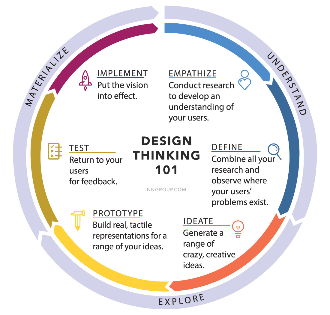
One of the most tried and tested ways of successfully getting from idea to a successful app is Design Thinking, as established by the Nielsen Norman Group (NNG). This is a sequential, iterative, user-centric process that is refined till a proper solution is achieved.
Empathy Mapping and Problem Definition
The process begins with deep user research by conducting interviews, observing behaviour, and creating empathy maps to truly understand what users say, think, do, and feel. This research allows designers to define a problem statement from a user perspective, such as, "How might we help our user pay their electric bill from home, without a trip to the bank?" This sets a clear goal to work towards.
Ideation and Prototyping
With a defined problem, designers can begin to brainstorm solutions. This process should introduce and evaluate multiple approaches to solving the problem. Next, a prototype is built. The prototype doesn’t have to be a polished, final product; a simple sketch on paper or a black-and-white wireframe that users can pick up and interact with will do. The goal is functionality - does the user understand what to do with the app on their own?
User Testing
The prototype is tested with a handful of actual users. As few as five people are enough to highlight any major usability issues, observe where they struggle, and look for issues like whether users need to squint at the font, are confused by any icons, or are searching for an option and having trouble finding it. This direct feedback on everything, from language and menu placement to colour choices and icon design, is the gold standard for revealing design flaws, and allows designers to effectively correct course.
Iteration and Implementation
Based on the feedback, the design is improved through iterations and refinements. The improved design is tested again with similar users, with checks to see if the solution is enabling them to solve the problem. This continuous process of testing and refining ensures that by the time the app is ready for implementation, it is genuinely user-friendly and serves the needs of its intended audience.
The mantra for designing in general, and particularly for elders, should be ‘less is more.’ A TV remote is a good example. The essential functions like volume, channel, and power are large, well-spaced, and easy to find.
THE PRINCIPLES OF COMPASSIONATE DESIGN
Once designers understand their users, they can build a design framework based on compassion and simplicity.
Simplicity and Minimalism
The mantra for designing in general, and particularly for elders, should be ‘less is more.’ A TV remote is a good example. The essential functions like volume, channel, and power are large, well-spaced, and easy to find. In contrast, advanced features are buried in complex menus. Good app design follows this same principle. The focus is on the most-used functions, which are made big, bold, and easy to tap. Complex gestures like pinching, swiping, or two-finger zooms should be avoided. If complex features need to be accessed, providing an information scent that guides users to discover them unassisted is ideal.
Well-defined references for best practices can be found at the Google Material Guidelines and Apple’s Human Interface Guidelines, with optimal contrast, sizing, and how people expect menus and elements to move. These are applied widely across many apps, and users will likely be able to adapt to them because they have seen them before.
Familiarity Over Novelty
The most successful designs will leverage existing mental models and real-world experiences. For example, using icons that resemble objects from daily life, such as a phone receiver for a call icon, provides instant recognition. To support this, labels should be used wherever practical, particularly when the icons used are somewhat generic. This familiarity creates a natural guide for users, reducing the learning curve and making the experience feel more intuitive.
Clear Communication and Feedback
Communication in an app for elders must be simple and unambiguous. Every screen should have a purpose - and the user should always know where they are in a journey. Long, complex blocks of text are difficult to read and immediately trigger stress. Simple, everyday language that is culturally relevant is ideal. Bilingual options are helpful with appropriately readable fonts. Voice-based input can be helpful, as this can bypass literacy challenges easily.
Feedback is equally important. A button tap should have a visual change in the button, a subtle vibration, or a confirming sound cue to reassure a user that their action was registered successfully. This simple feedback loop builds confidence and reduces the anxiety of making a mistake.
Building Trust
Many older adults are wary of technology due to horror stories about scams or because they have a sense of anxiety about being in an unfamiliar space. Therefore, design must prioritise building and maintaining trust. This can be achieved through clear and reassuring language, for example, asking "Where to?" instead of "Destination" in a ride-sharing app. Assurance can also be provided by always showing users a way out of an action through a prominent ‘Back’ or “Cancel” button, and by making help contextually accessible. Well-placed tooltips and help buttons go a long way towards putting users at ease. For actions with high impact, asking for confirmation and adding a little delay with a progress bar are good ways to reassure users that they are in control.
Designing for elder users is an exercise in empathy. Building on a robust understanding of users and focusing on simplicity, familiarity, and trust can create technology that gives agency and security back to seniors, helping them stay connected and independent going forward. Doing this in apps can make them relevant and likely to be both useful and used.


%20Square%20Ad%20-11.jpg&w=640&q=75)
%20Horizental%20AD-01.jpg&w=3840&q=75)
